
The Color Scheme Nobody Talks About
Dark mode has become ubiquitous in consumer apps—from social media to streaming platforms. But in business software, particularly tools used for production tracking, CRM management, and operational dashboards, the choice between light and dark interfaces isn't just aesthetic. It's a fundamental decision that affects how operators process information during eight-hour shifts, how sales teams manage pipeline velocity under pressure, and how manufacturing supervisors monitor real-time alerts without visual fatigue.
Most business software still defaults to stark white backgrounds with black text—a holdover from the paper-document era. Yet the humans using these systems aren't reading static reports anymore. They're scanning dynamic dashboards, toggling between CRM cards, updating production phases, and responding to alerts in environments where screen time isn't occasional—it's continuous.
The Physiology of Prolonged Screen Exposure
Research on visual ergonomics reveals that bright white interfaces increase pupil constriction and require more frequent accommodation adjustments from the eye's ciliary muscles. Over extended periods, this contributes to what optometrists call computer vision syndrome—eye strain, dry eyes, blurred vision, and headaches.
Dark mode interfaces reduce overall luminance, particularly in environments where ambient lighting can't match screen brightness. For shop floor operators using station tablets under fluorescent lighting, or CRM managers working late to close month-end deals, a dark interface minimizes the contrast shock between screen and surroundings.
But here's the critical nuance: dark mode isn't universally superior. In high-ambient-light environments—like manufacturing floors with skylights or offices with large windows—dark interfaces can create glare and reduce readability. The optimal solution isn't dogmatic adherence to one scheme, but intentional design that considers the operational context.
Contrast, Hierarchy, and Decision Speed
Beyond eye strain, color schemes affect information hierarchy and decision-making speed. In a light-mode CRM pipeline, every card competes for attention equally. In a well-designed dark interface, accent colors—like a vibrant yellow for overdue tasks or urgent alerts—create instant visual priority without relying on size or position alone.
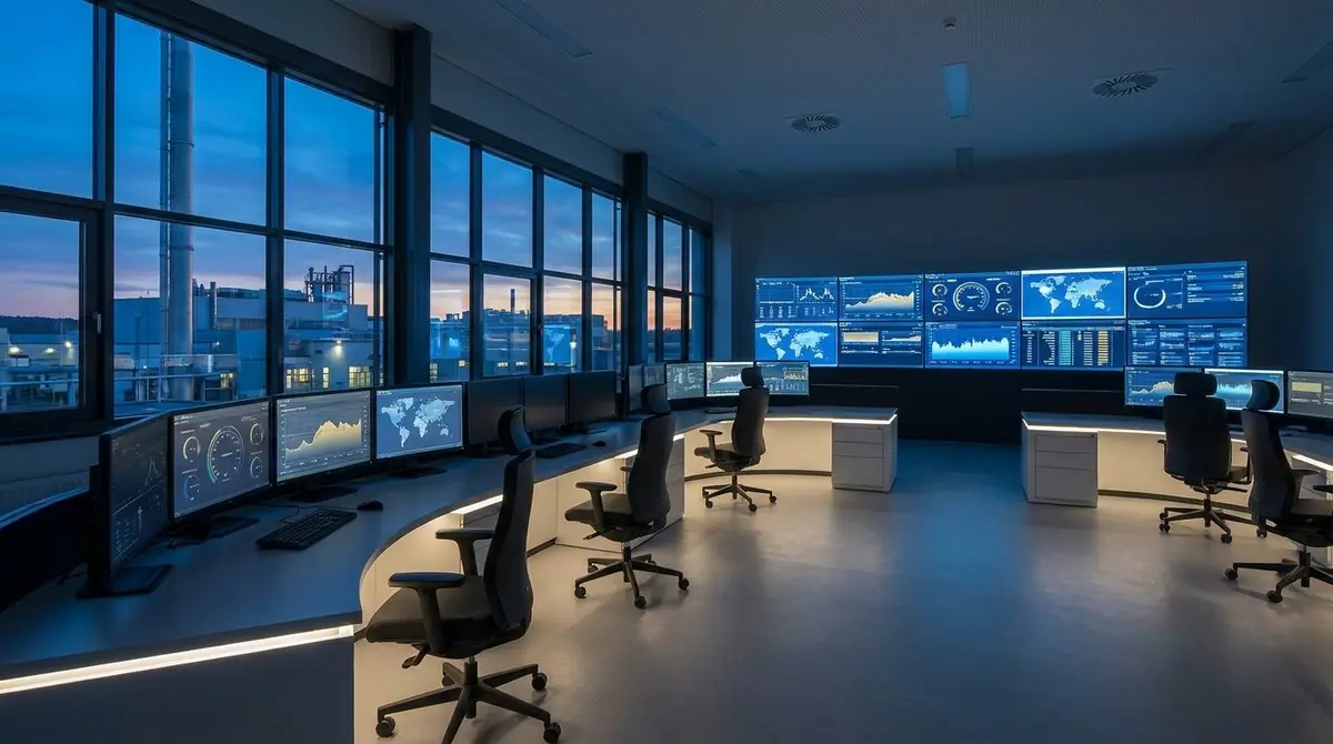
This matters in high-frequency operational software. A production supervisor scanning a command center dashboard doesn't have time to read every status label. They need to see at a glance which stations are blocked, which orders are behind schedule, and which alerts require immediate action. Dark backgrounds allow bright accent colors to function as true signals rather than decorative noise.
Consider the difference: a red alert badge on a white background registers as "important." The same red badge on a dark background registers as "urgent—act now." The surrounding darkness amplifies the signal, reducing cognitive load and shortening response time.
The Typography Challenge in Dark Interfaces
Implementing dark mode isn't as simple as inverting colors. Typography that works beautifully on white backgrounds often fails in dark contexts. Thin sans-serif fonts become spindly and hard to read. Letter-spacing that feels balanced in light mode can create uncomfortable gaps in dark mode. Weight adjustments become necessary—what reads as "regular" weight on white may need to be rendered as "medium" on dark to maintain the same perceived density.
This is why design systems matter. A cohesive approach to typography, spacing, and color ensures that dark mode isn't an afterthought or a simple CSS filter, but a parallel design language optimized for low-luminance environments. The typeface choice itself becomes critical—geometric sans-serifs with consistent stroke widths and generous x-heights maintain readability across both light and dark contexts.
When Dark Mode Becomes Default-First Design
The most sophisticated approach isn't offering dark mode as an optional theme, but designing dark-first and ensuring light mode works as an equally viable alternative. This inverts the traditional hierarchy and forces designers to solve the harder problem first: making information architecture, color hierarchy, and typography work in a low-luminance environment.
When dark mode is the foundation, accent colors must be chosen for maximum impact. Backgrounds must provide enough contrast for white text without causing eye strain. Interactive elements must signal affordance through more than just color—hover states, borders, and shadows become essential. The result is a more intentional, more accessible design system that works across contexts.
The JellyMachine Dark-First Philosophy
JellyMachine's design system is built dark-mode-first using Tailwind's sophisticated color palette and the Manrope typeface—a geometric sans-serif with excellent readability at all weights. The jelly and jellyYellow accent colors provide high-contrast visual hierarchy against dark backgrounds, ensuring that urgent alerts, active pipeline cards, and production phase updates stand out instantly.
For operators using station tablets on the shop floor, this means less eye strain during long shifts. For sales teams managing CRM pipelines, it means faster visual scanning and reduced decision fatigue. For manufacturing supervisors monitoring the command center dashboard, it means critical andon alerts break through the visual noise without requiring additional cognitive processing.
The system isn't locked into dark mode—users can switch to light mode if their operational environment demands it. But the default-first approach ensures that the most common use case—extended screen time in mixed-lighting environments—is optimized from the ground up. It's not a cosmetic choice. It's an operational design decision that respects the reality of how business software is actually used.
The Broader Lesson: Design for Operational Reality
The dark mode conversation is really about a larger principle: business software should be designed for the conditions in which it's actually used, not for the idealized scenarios in marketing screenshots. Operators don't use production tracking systems for twenty minutes a day—they use them for entire shifts. CRM managers don't check pipelines occasionally—they live in them. Manufacturing supervisors don't glance at dashboards—they monitor them continuously.
When software design accounts for these realities—extended screen time, mixed lighting, high-frequency interaction, urgent alert prioritization—the interface becomes a tool that supports operational focus rather than draining it. Dark mode, implemented thoughtfully, is one piece of that puzzle. But it's a piece that matters more than most vendors acknowledge.